Sunday 31 March 2013

The font for 'REVEALED'


This was the font that I liked the best out of all of the fonts I had analysed and looked at. I was impressed by the look of this font as I felt it was simple yet sophisticated and worked well. To make it work better with the colour scheme, I added an outline to the writing.


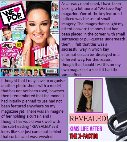
When I compared the front cover with the contents page, I realised that there was nothing strongly linking the pages together. For this reason I decided to use a font I had used on the front cover for the contents page title- ‘REVEALED’ too. (Font= Bebas)


Thursday 28 March 2013

Basic Plan on how the Final Contents Page should look

Thinking about the Presentation

After thinking about the basic look of the contents page, I realised that if I add information on the page it may clash with the background due to the bright colours. To create a base from which I can start to adding information, I added a white square, to separate a certain section of the page from the rest. 


Monday 25 March 2013

Stick to Pop Conventions


Throughout the process of creating my front cover, I used ‘We Love Pop’ magazine as my biggest inspiration. When comparing a real life example to my own front cover (POPSTERS), a lot of similarities can be noticed.
 

Some examples include;

-Mid shot of main artist
-Artists name is bold
-A quote is always added which relates back to the main artist
-The use of capital letters as well as lowercases (highlighting the importance of the text, e.g. the text in capital letters may be more eye-catching and interesting for readers.

Monday 11 March 2013

Changing the Shape


From the start, I had planned out my flat plan as accurately as possible.

Initially, I had planned to include an explosion shape however when I actually applied this to the page, it looked unprofessional. When I asked my media teacher about this, she agreed with me and also told me that the text was also unrealistic. 


To improve this, I stuck with the idea of including a shape that stands out a lot more than other writing however I changed the shape it a circle and edited the text to something a little more realistic and believable.


This is how the shape looked after I made the change.